You don’t need to be an expert artist to build a website that works—you just need the right ingredients and some proven strategy.
At NeoVisage, we’re on a mission to build 500 client-attracting and converting websites by 30 March 2035. That means staying updated with what top digital experts recommend—and translating that into action for our clients. This guide is part of that journey.
Table of Contents
- What “High-Converting” Really Means
- A Few Expert Insights on What Makes a Site Convert
- The 5 Core Elements of a High-Converting Website
- Tools and Templates That Do the Heavy Lifting
- 3 Mistakes to Avoid When Building Without a Designer
- Your Turn: Build With Purpose
What “High-Converting” Really Means
According to industry experts, a high-converting website is one that engages site visitors and leads them to take one desired action.
Some examples include placing a booking, buying a product, filling a form, making a call, and so on.
A Few Expert Insights on What Makes a Site Convert
Some experts, such as Neil Patel, Unbounce, and Hubspot, recommend several ingredients for a high-converting website. These include:
- Having a clear Call-To-Action (CTA).
- Having a clear Unique Value Proposition, usually placed on top of the page.
- Including social proof and testimonials.
- Using and testing compelling headlines.
- Improving your site speed.
- Optimizing your site for mobile screens.
The 5 Core Elements of a High-Converting Website
1. Use a Clear Value Proposition
A clear value proposition, also known as a unique value proposition should include a compelling headline, a sub-headline, and benefits the customer will receive from doing business with you.
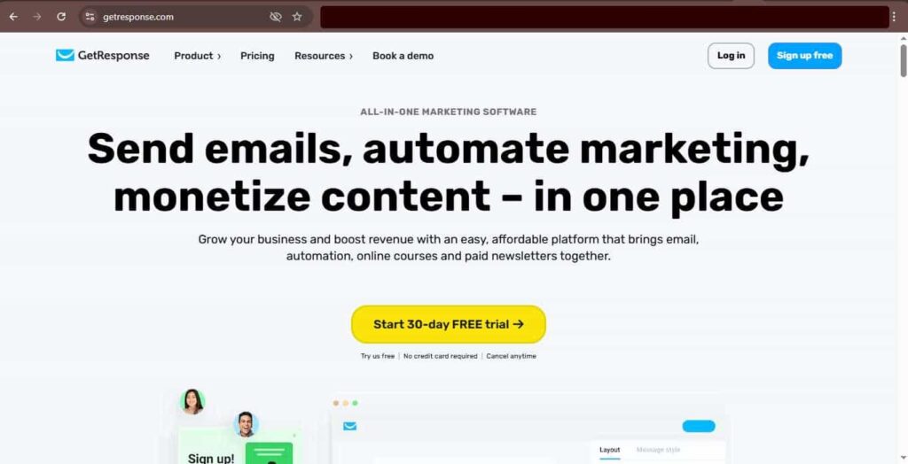
Neil Patel says, “Visitors should clearly see on your homepage or landing page why they should do business with you and the benefits of doing so.”
For example here is GetResponse’s unique value proposition below:
2. Have a Strategic Layout
Make your website or landing page have a visual hierarchy. Give sections clear and structured headings.
Your layout should include white space and should be designed with a mobile-first layout in mind. This means you should choose your words carefully to maximize the smaller screens, and even if you are including white space, don’t use too much space.
This will make your website content easy to read, and responsive (easily viewed on mobile screens).
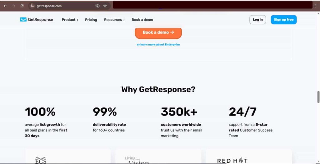
For example, take a look at the white space on GetResponse’s landing page:
3. Make Your Copy Persuasive
Remember to write compelling content that will evoke emotion within your site visitors, and guide them to take your desired action.
Your copy should use simple, yet intelligent English, it should be scannable, with a maximum of 2 to 3 sentences per paragraph.
Make sure your content is customer-focused. You should be able to clearly explain how you can solve your site visitor’s problems or pain points.
You can use any of the known copywriting frameworks. For instance:
- AIDA (attention, interest, desire, action)
- Problem-Agitate-Solution (pas)
- 4Ps: picture, promise, proof, push
4. Include Trust Builders
Include trust-building elements (social proof), such as testimonials, guarantees, and case studies.
While reporting a study commissioned by Trustpilot, Hubspot stated that “89% of consumers check online reviews before making a purchase.”
They also recommend adding “testimonials and reviews right on your site so visitors don’t have to go to a third-party site.”
Guarantees encourage clients to make a purchase without fear of things going south. It gives them more confidence to act.
5. Have a Clear CTA (Call-to-Action)
A clear CTA tells your site visitor the next step to take. You can use a button, placed strategically, for a CTA.
Ensure your call to action is not confusing, and it should have a sense of urgency attached to it.
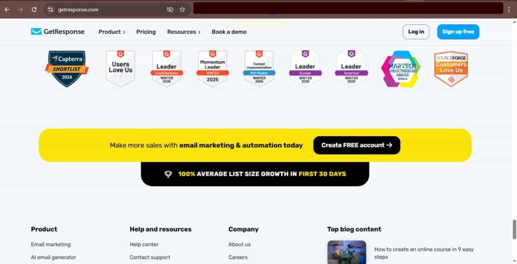
For example, here is the Call-to-Action on GetResponse’s page (the “Create FREE account” Button):
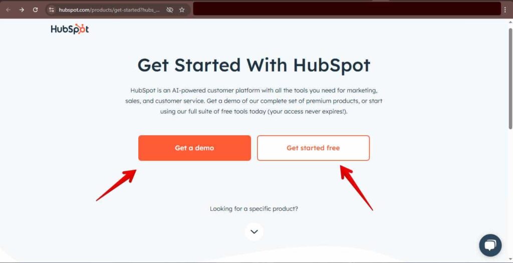
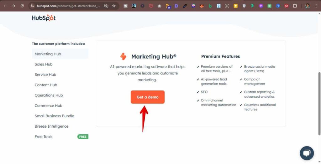
Sometimes, you can have multiple CTAs on one page to cater to more than one type of customer. For instance, here are two CTAs on the same landing page by HubSpot.com:
Tools and Templates That Do the Heavy Lifting
Now that you understand what building a high-converting website entails, how can you get it done easily?
You can use tools and templates such as Elementor, GeneratePress with GenerateBlocks, Astra, and so on.
These tools already have starter templates you can build with, without having to start from scratch.
They also make it easier to edit created sites to meet your needs.
These recommended tools and templates also have a great support system and community, so you will always get help whenever you need it.
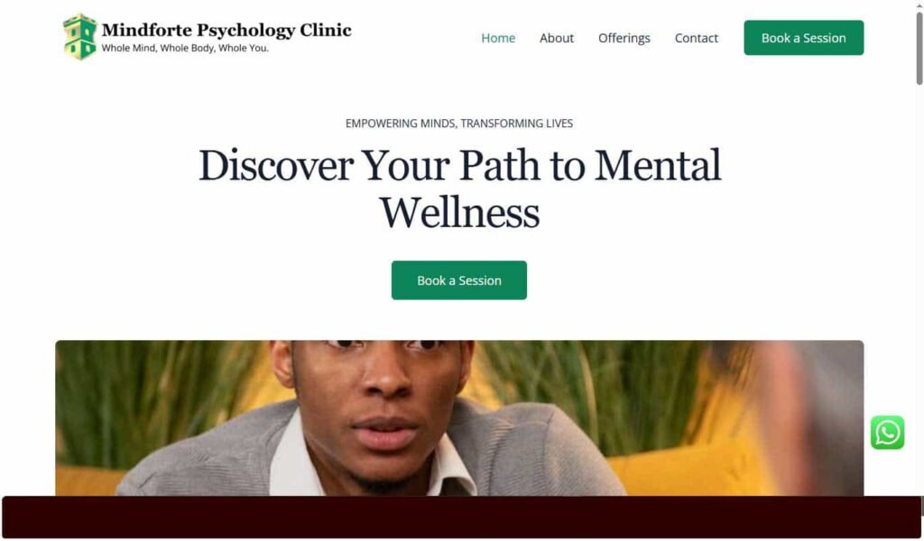
Here’s an example of a site we built using one of the tools mentioned above:
3 Mistakes to Avoid When Building Without a Designer
1. Using too many fonts/colors
Don’t use too many fonts or colors when building your high-converting websites.
According to design experts, use a maximum of 3 fonts or colors to avoid designs that are jarring to the eyes.
2. Copy-pasting templates without editing for your audience
When you use a tool or starter template for your website, remember to edit it appropriately for your audience.
It will make your website unique, even if you use the same template that has been used on multiple sites.
3. Ignoring mobile responsiveness
Make your site mobile-responsive so that your site will look good on all screens.
Josh Gallante of Unbounce.com says, “Be sure the experience a user has is consistent across every device they may use to access your pages.”
This is because you cannot be sure what device your visitors will use to view your site, so they should be comfortable using any device.
Your Turn: Build With Purpose
You don’t need perfection. You need progress. Use this article as a blueprint, or download our free High-Converting Website Checklist to start building with confidence.